
台灣公共電視有簡介
MetroNapoli's publicly funded project transforms local metro stations into commuter-friendly art spaces that are some of the most impressive in Europe

 Daniela Walker on January 25, 2013. @emptyofpocket
 Say the word subway and you think: dirty, dark and rats. But in Naples, Italy, an ongoing public art project has transformed 13 metro stations into works of art, with the most recent on Via Toledo being named one of The Daily Telegraph‘s most impressive undergrounds in Europe.
The project began a decade ago as part of MetroNapoli‘s efforts to renew Naples’ urban landscape.
The Art stations originated from a project formulated by the city government with a view to make the urban area’s public transport centers more attractive and to give everyone a chance to get an up-close look at prime examples of contemporary art Under the direction of Achille Bonto Oliva, former director of the Venice Biennale, several stations have been converted into art galleries displaying over 180 works by more than 90 artists and architects such as Alessandro Mendini, Anish Kapoor, Gae Aulenti, Karim Rashid, and Sol LeWitt. Not only do these stations function as underground galleries, but they are architectural feats that stand alone as works of art.
 The latest station, Metro Toledo, which is situated under one of Naples’ main shopping streets, was designed by the Spanish firm of architect Oscar Tusquets Blanca and opened after some delay in September 2012. It was designed around the theme of water and light with mosaics by South African artist William Kentridge and works by Francesco Clemente, Ilya and Emilia Kabakov, Shirin Nehsat and Oliviero Toscani on display.
 MetroNapoli’s art stations make up a decentralized museum that is spread throughout the city. The project makes art integral to the cityscape, and more importantly, accessible to the everyday commuter. Instead of tired eyes gazing wearily at the evening paper, people are given an aesthetically-complex environment to interact and engage with – all for the small price of a metro ticket.
Click below to see some of Naples’ most impressive stations:


MetroNapoli
紐約時報
Scene/SeenSubterranean Naples, Brimming With Art

Giulio Piscitelli for the International Herald Tribune
The Toledo subway station in
Naples was designed by the Catalan architect Oscar Tusquets Blanca and
has a light panel seascape by Robert Wilson.
By ELISABETTA POVOLEDO
Published: February 15, 2013
Above ground, the raucous bustle that is Naples perfunctorily
orchestrates its moving components into a daily rhythm that is
effectively functional chaos, against a dissonant background juxtaposing
luxurious Baroque palazzos with derelict housing.
Giulio Piscitelli for the International Herald Tribune
Black-and-white photographs of Greco-Roman statues by Mimmo Iodice line the Museum station atrium.
“The art works are respected, they haven’t been vandalized,” said Ms. Di
Nocera, the municipal counselor. It’s a “public miracle,” especially in
a city that “has the ability to self-destruct.”
Speaking to locals, it’s clear that Neapolitans are proud of the subway.
“It gives a different idea of Naples, which usually gets into the news
because of the local Mafia,” said Alessandro Arzeni, an accountant. “And
now it’s easier too for tourists to move around, on a subway, like any
major city.”
Did he think locals would be riding it much? “Neapolitans are lazy, they’d rather take a car,” he said.
This article has been revised to reflect the following correction:
Correction: February 18, 2013
A previous version of this article misstated the first name and affiliation of Mr. Silva. He is Giannegidio Silva, not Gianni. He is the president of M.N. Metropolitana di Napoli S.p.A, which builds the subway, not president of MetroNapoli, the company that manages the subway.
University of Naples Metro Station by Karim Rashid
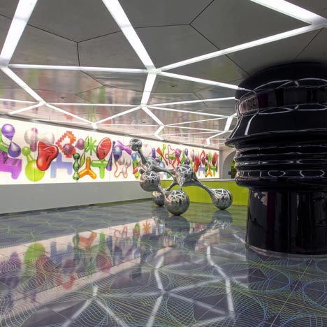
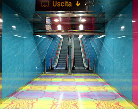
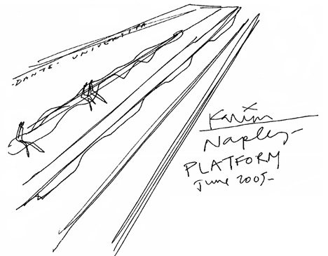
New York designer Karim Rashid has renovated the University of Naples subway station in Naples, Italy.
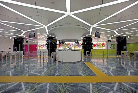
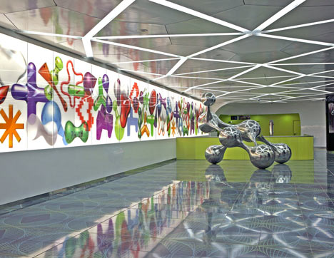
Commuters pass between huge columns with the profiles of faces towards a shifting lenticular wall of graphic patterns.
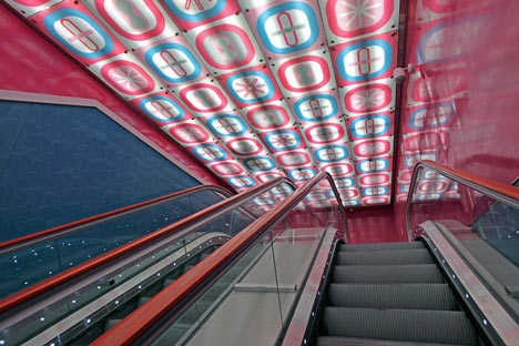
Sculptures and graphic artworks line the escalators, leading to platforms with backlit patterns on the walls.
More about Karim Rashid on Dezeen »
The information below is from Karim Rashid:
The University of Naples subway station is highly trafficked by a multi-cultural, academic community of thousands of passengers a day.
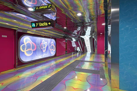
A creative concept that communicates and embodies knowledge in the new digital age, language in the shrinking global landscape, innovation and mobility in this third technological revolution.
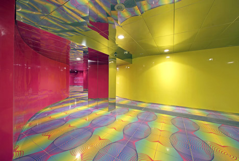
Naples is no longer a historic southern city of Italy but instead now is an integral intellectual information haven that extends itself throughout the rest of the world.
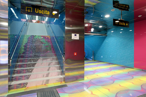
This is the changing Italy and the station is a metaphor of this new wired global condition. It integrates the station with its surroundings, as well as provides a platform for innovative, cutting-edge design strategy.
We utilize the descension from the piazza to the subway platforms to represent a metaphorical shift from the conscious brain to the spiritual mind. Experiencing this journey, the commuter is able to define one’s own experience by interpreting the individual shift from a busy “brain state” to a focused “mind state”.
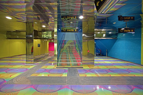
Entering into the station from the piazza to the subway station, the visitor will walk though a space clad with tiles, each one with is printed with new words created in this last century. Once the visitor arrives in the station lobby, he/she is impacted by the soft nature of the space, the striking palette of colors and patterns.
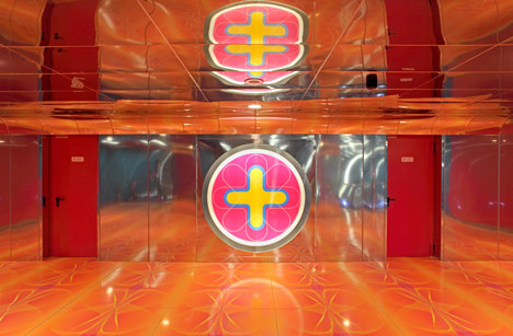
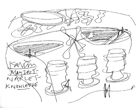
Along the back wall of the station lobby level, lenticular iconography changing colors and perspective provides an interesting siteline as commuters proceed to the platforms below. Intersecting the space between the heads profile benches (metaphorically intersecting the dialogue) is an abstracted, SYNPOSIS sculpture reflecting the nodes of the brain and the synapses which occur within.
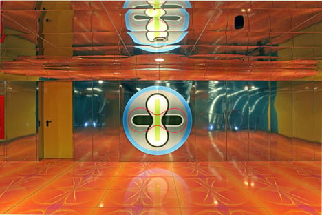
When descending to the subway platforms via escalator, a visitor experiences a transition from the busy piazza to a more intimate, focused environment. It is here where we display various artworks and other graphic art as a focal point. These abstract images invoke the user to shape the environment according to his/her own creative interpretations.
Rolling LED programming situated behind frosted glass displays universally recognized words, referencing knowledge and the multicultural university setting.
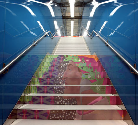
Descending and ascending the stairwells on each respective platform, the steps have abstracted portraits of Dante and Beatrice. Once the commuter arrives at the end of the escalator, transformational digital art follows he/she to the platform stairways. The accent colors, lime and pink, indicates the direction and guide visitors through the descent to the final destination.
Airframe surfaces speak about the beauty of our airframe voxels of the flux and ever dynamicmultidimensional information and data age (infostethiks).
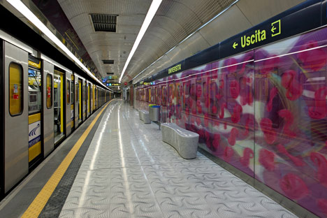
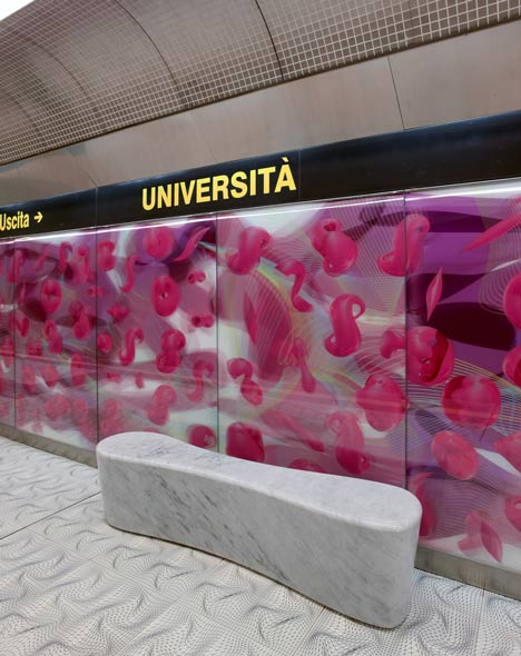
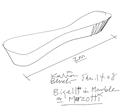
The platform level of the subway station is where the people spend the most static time. One’s experience while waiting for the subway is enhanced by the tranquil, imaginative environment of the “mindstate”. Seating is provided in the form of landscape forms.
The back wall of the subway platform is a backlit artwork, providing a continuous soft glow in the space. Across the platform, digital artwork creates an entertaining distraction. In addition to related iconography, the piece could include a shadow of an oncoming train, etc. to signify a train’s arrival.
A subway station is a temporal, transitional space, yet the commuter is contained for a short period of time before continuing his/her journey.
As he/she transitions from one environment to another, he/she is most likely reviewing the day’s previous events, or preparing for the next task. Our concept focuses on the commuter experience within the train station, and how the surrounding environment can serve as a respite in a day’s schedule.

Commuters pass between huge columns with the profiles of faces towards a shifting lenticular wall of graphic patterns.

Sculptures and graphic artworks line the escalators, leading to platforms with backlit patterns on the walls.

More about Karim Rashid on Dezeen »

The information below is from Karim Rashid:
The University of Naples subway station is highly trafficked by a multi-cultural, academic community of thousands of passengers a day.

A creative concept that communicates and embodies knowledge in the new digital age, language in the shrinking global landscape, innovation and mobility in this third technological revolution.

Naples is no longer a historic southern city of Italy but instead now is an integral intellectual information haven that extends itself throughout the rest of the world.

This is the changing Italy and the station is a metaphor of this new wired global condition. It integrates the station with its surroundings, as well as provides a platform for innovative, cutting-edge design strategy.

We utilize the descension from the piazza to the subway platforms to represent a metaphorical shift from the conscious brain to the spiritual mind. Experiencing this journey, the commuter is able to define one’s own experience by interpreting the individual shift from a busy “brain state” to a focused “mind state”.

Entering into the station from the piazza to the subway station, the visitor will walk though a space clad with tiles, each one with is printed with new words created in this last century. Once the visitor arrives in the station lobby, he/she is impacted by the soft nature of the space, the striking palette of colors and patterns.

Along the back wall of the station lobby level, lenticular iconography changing colors and perspective provides an interesting siteline as commuters proceed to the platforms below. Intersecting the space between the heads profile benches (metaphorically intersecting the dialogue) is an abstracted, SYNPOSIS sculpture reflecting the nodes of the brain and the synapses which occur within.

When descending to the subway platforms via escalator, a visitor experiences a transition from the busy piazza to a more intimate, focused environment. It is here where we display various artworks and other graphic art as a focal point. These abstract images invoke the user to shape the environment according to his/her own creative interpretations.

Rolling LED programming situated behind frosted glass displays universally recognized words, referencing knowledge and the multicultural university setting.

Descending and ascending the stairwells on each respective platform, the steps have abstracted portraits of Dante and Beatrice. Once the commuter arrives at the end of the escalator, transformational digital art follows he/she to the platform stairways. The accent colors, lime and pink, indicates the direction and guide visitors through the descent to the final destination.
Airframe surfaces speak about the beauty of our airframe voxels of the flux and ever dynamicmultidimensional information and data age (infostethiks).
The platform level of the subway station is where the people spend the most static time. One’s experience while waiting for the subway is enhanced by the tranquil, imaginative environment of the “mindstate”. Seating is provided in the form of landscape forms.

The back wall of the subway platform is a backlit artwork, providing a continuous soft glow in the space. Across the platform, digital artwork creates an entertaining distraction. In addition to related iconography, the piece could include a shadow of an oncoming train, etc. to signify a train’s arrival.

A subway station is a temporal, transitional space, yet the commuter is contained for a short period of time before continuing his/her journey.

As he/she transitions from one environment to another, he/she is most likely reviewing the day’s previous events, or preparing for the next task. Our concept focuses on the commuter experience within the train station, and how the surrounding environment can serve as a respite in a day’s schedule.

沒有留言:
張貼留言
注意:只有此網誌的成員可以留言。